5/5 - (7 votes) Miami Vice Font, a crime drama TV series from the 1980s, revolves around two undercover detectives confronting drug traffickers and criminals in the vibrant backdrop of Miami, Florida. Download Font The title lettering of the “Miami Vice” TV series poster prominently showcases the Broadway D. This distinctive font belongs to the Broadway Font Family, designed by Morris Fuller Benton and published by URW Type Foundry. The initial font employed in the logo title boasts an exquisite and ornate design, recognized as the Broadway font. This sophisticated typeface offers a range of 16 styles, spanning from regular to Flat 3D Filled Italic, with corresponding Italics for each style. Ideal for various applications such as logotypes, headlines, titling, quotes, and fashion designs, the Broadway font adds a touch of decorative and artistic flair to its versatility. Miami Vice Font Information Name Miami Vice Designer Morri...
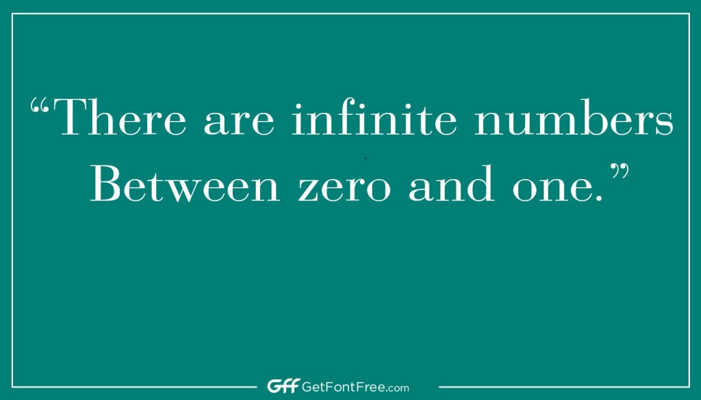
Bodoni Font is a serif typeface that was created by the Italian typographer and printer Giambattista Bodoni in the late 18th century. Bodoni was designed as a display typeface, intended for use in titles and headlines rather than in body text.
Bodoni’s style is characterized by its high contrast between thick and thin strokes, as well as its sharp, vertical serifs. Bodoni is also notable for its geometric precision and uniformity, which gives it a modern and elegant appearance.
Bodoni’s popularity has endured for over two centuries, and it remains a popular typeface in both print and digital media. It has been used in a wide range of applications, including advertising, book design, and packaging. Many notable designers and typographers have contributed to the development of Bodoni over the years, including Morris Fuller Benton, who created a version of the typeface for the American Type Founders in the early 20th century.
Bodoni Font Information
| Name | Designer | Foundry | Style | File Format | Date Released | License | Type |
|---|---|---|---|---|---|---|---|
| Bodoni | Giambattista Bodoni | Several Foundries | Serif | OTF, TTF | Late 18th c. | Commercial | Display |
| Bodoni 72 | Giambattista Bodoni | Linotype | Serif | OTF, TTF | 1970 | Commercial | Display |
| Bodoni XT | Manfred Klein | Manfred Klein | Serif | OTF, TTF | 2003 | Free | Display |
| ITC Bodoni | Giambattista Bodoni | ITC | Serif | OTF, TTF | 1978 | Commercial | Display |
| Bauer Bodoni | Giambattista Bodoni | Bauer Type Foundry | Serif | OTF, TTF | 1926 | Commercial | Display |
| Bodoni Egyptian | Giambattista Bodoni | Stephen Coles | Egyptian | OTF, TTF | 2010 | Commercial | Display |
| Bodoni Classic | Gert Wiescher | Wiescher Design | Serif | OTF, TTF | 2003 | Commercial | Display |
Use cases
Sure! Here are some common use cases for the Bodoni font:
- High-end fashion and luxury branding: Bodoni’s elegant and refined appearance has made it a popular choice for luxury fashion brands, perfume labels, and other high-end products that want to convey a sense of sophistication and luxury.
- Editorial and book design: Bodoni’s legibility and timeless design make it a popular choice for book covers, chapter titles, and editorial layouts in magazines and newspapers.
- Wedding invitations and event stationery: Bodoni’s classic, formal style makes it a great choice for wedding invitations, save-the-dates, and other event stationery.
- Advertising and marketing materials: Bodoni’s high contrast and bold strokes make it a great option for advertising headlines, posters, and billboards.
- Logos and wordmarks: Bodoni’s sleek and modern appearance makes it a popular choice for logos and wordmarks for businesses in industries such as fashion, beauty, and hospitality.
Characteristics
Bodoni is a serif typeface that was created by Italian designer Giambattista Bodoni in the late 18th century. It is a classical font with a distinct personality that has been used in a wide range of applications, from book typography to advertising.
Here are some key features and characteristics of Bodoni Font:
- Calligraphic style: Bodoni is characterized by its sharp, thin serifs and vertical axis, giving it a calligraphic quality. The design is based on the contrast between thin and thick strokes, with a strong emphasis on geometric forms and straight lines.
- Elegant curves: Despite its emphasis on straight lines and geometric shapes, Bodoni also features elegant curves, particularly in its lowercase letters. The curves are subtle and refined, adding a touch of sophistication to the font.
- High contrast: Bodoni is known for its high contrast between thick and thin strokes, creating a bold, striking appearance. This high contrast also makes the font particularly well-suited for use at large sizes, such as in headlines or titles.
- Modernist influence: Bodoni was created during the era of Neoclassicism, but it also reflects the influence of the Modernist movement. Bodoni’s clean lines, emphasis on geometric forms, and lack of decorative flourishes are all characteristic of Modernist design.
- Clear and legible: Despite its ornate appearance, Bodoni is a highly legible font, particularly at larger sizes. The sharp, clean lines and generous spacing between letters make it easy to read, even from a distance.
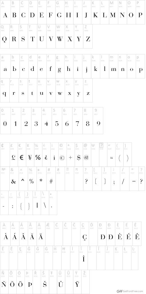
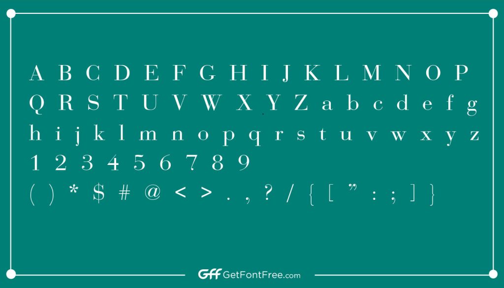
Character Map
Comparison
Bodoni Font is a unique typeface with a distinctive appearance that sets it apart from other similar fonts. Here are some comparisons with other similar fonts, along with Bodoni’s unique qualities and strengths:
- Didot Font: Didot is a serif typeface that is often compared to Bodoni due to its high contrast and thin strokes. However, Didot has a more delicate appearance, with less pronounced serifs and a greater emphasis on curves. Bodoni, on the other hand, has sharper serifs and a more geometric appearance.
- Times New Roman Font: Times New Roman is a classic serif font that has been widely used in print and digital media for decades. While it shares some similarities with Bodoni, such as its vertical axis and serif structure, Times New Roman has a more conservative, traditional appearance. Bodoni, on the other hand, has a more modern, refined look.
- Garamond Font: Garamond is another classic serif font that is often used in book typography. While it has some similarities to Bodoni, such as its emphasis on vertical lines and geometric forms, Garamond has a more delicate, hand-crafted appearance. Bodoni, in contrast, has a more precise, mechanical quality.
Bodoni’s unique qualities and strengths include:
- Bold and striking appearance: Bodoni’s high contrast and sharp serifs give it a bold, striking appearance that makes it well-suited for use in headlines, titles, and advertising.
- Modernist influence: Bodoni’s clean lines and emphasis on geometric forms reflect the influence of the Modernist movement, giving it a modern, contemporary feel.
- Legibility at large sizes: While Bodoni’s ornate appearance might suggest otherwise, it is actually highly legible at larger sizes, making it a versatile font for a range of applications.
- Distinctive personality: Bodoni has a strong personality and a unique appearance that sets it apart from other similar fonts, making it a popular choice for designers looking to make a statement.
Bodoni Font Family Includes a Total of Typefaces
The Bodoni font family includes a total of several typefaces, each with its own unique characteristics and variations. The exact number of typefaces can vary depending on the source, but typically the Bodoni family includes at least 4 or 5 main variations, which are:
- Bodoni Regular: This is the standard weight of the Bodoni font family. It features a vertical axis, high contrast, and sharp serifs, giving it a bold and striking appearance.
- Bodoni Bold: As the name suggests, this weight of the Bodoni font family is bolder and heavier than the regular weight. It is often used for emphasis or to create a strong visual impact.
- Bodoni Italic: This is the italicized version of the Bodoni font, with slanted letters that give it a more dynamic and fluid appearance.
- Bodoni Book: This weight of the Bodoni font family is lighter and thinner than the regular weight, making it well-suited for body text or smaller sizes.
- Bodoni Ultra: This is the heaviest weight of the Bodoni font family, with thick, bold strokes that make it particularly well-suited for use in large headlines or titles.
Alternatives of Bodoni Font
Bodoni is a classic typeface with a distinctive, high-contrast look that has been popular for centuries. If you’re looking for alternatives to Bodoni, here are a few options to consider:
- Didot: This typeface is similar to Bodoni, with its elegant, high-contrast strokes and sharp serifs. However, Didot is generally considered to be a bit more refined and delicate than Bodoni.
- Walbaum: Walbaum is another classic typeface that is similar to Bodoni in terms of its high-contrast strokes and sharp serifs. However, Walbaum has a slightly more contemporary feel, with softer curves and a more modern look overall.
- Playfair Display: If you’re looking for a Bodoni alternative with a more contemporary feel, Playfair Display is a great option. This typeface combines classic serifs with modern styling, resulting in a sophisticated look that is both timeless and up-to-date.
- Mrs. Eaves: Mrs. Eaves is a modern take on the classic Bodoni typeface. It features softer curves and more delicate serifs, resulting in a typeface that is both elegant and approachable.
- Baskerville: Baskerville is another classic typeface that is similar to Bodoni in terms of its high-contrast strokes and sharp serifs. However, Baskerville has a more traditional, classic feel, with a bit less of the modern flair that you might find in other alternatives.
Tips and Tricks
Bodoni is a beautiful and classic font that has been used for centuries. Here are some tips and tricks for using it effectively in your designs:
- Pair it with a contrasting font: Bodoni has a strong and elegant look that pairs well with contrasting fonts. Consider pairing it with a sans-serif font, like Helvetica or Arial, for a modern look, or with a serif font, like Garamond or Caslon, for a more traditional feel.
- Use it for headings and titles: Bodoni is a great choice for headings and titles, as its high-contrast strokes and sharp serifs make it stand out and command attention. Consider pairing it with a simpler font for body text to create a balanced design.
- Choose the right size: When using Bodoni, it’s important to choose the right size for your design. Bodoni looks best when it’s used in larger sizes, as the details of the font can get lost at smaller sizes. For headings and titles, consider using a size of 30pt or larger.
- Use it sparingly: While Bodoni is a beautiful font, it can be overpowering if used too much. Consider using it sparingly, perhaps just for headings or specific design elements, to create a more balanced and cohesive design.
- Experiment with color: Bodoni looks great in black and white, but don’t be afraid to experiment with color as well. Consider using a deep, rich color like burgundy or navy for a sophisticated look, or a brighter color like yellow or pink for a more playful design.
Supported Languages
Kildin Sami, Komi-Permyak, Kurdish, Kurdish (Kurmanji), Khanty, Greek, Greenlandic, Kyrgyz (Cyrillic), Ladin, Latvian, Lithuanian, Lojban, Lombard, Low Saxon, Luxembourgian, Macedonian, Malagasy, Malay (Latinized), Maltese.
Conclusion
In conclusion, Bodoni is a versatile and elegant font that has been used for centuries in various design projects. To use it effectively, it’s important to pair it with contrasting fonts, use it for headings and titles, choose the right size, use it sparingly, and experiment with color.
Bodoni’s distinctive high-contrast strokes and sharp serifs make it stand out and command attention, making it a great choice for titles, headings, and other design elements. It pairs well with contrasting fonts, such as sans-serif or serif fonts, and looks best when used in larger sizes.
While Bodoni is a beautiful font, it’s important to use it sparingly and balance it with simpler fonts for body text to create a cohesive design. By experimenting with color, Bodoni can be used to create both sophisticated and playful designs.
FAQs
Who created the Bodoni font?
Bodoni font was created by Giambattista Bodoni, an Italian typographer, in the late 18th century.
What type of font is Bodoni?
Bodoni is a serif font with high contrast between thick and thin strokes, sharp serifs, and minimal adornment.
What is Bodoni font used for?
Bodoni font is commonly used for headings, titles, logos, and other design elements that need to stand out and command attention.
What are some alternatives to the Bodoni font?
Some alternatives to Bodoni font include Didot, Walbaum, Playfair Display, Mrs. Eaves, and Baskerville.
Is Bodoni font suitable for body text?
While Bodoni can be used for body text, it is generally not recommended due to its high contrast and sharp serifs, which can make it difficult to read in smaller sizes. It’s best used for headings and titles.
Can Bodoni font be used for web design?
Yes, Bodoni font can be used for web design, but it’s important to ensure that the font is optimized for the web and that the appropriate licenses have been obtained.
Is Bodoni font free?
No, Bodoni font is not free. It is a copyrighted font that must be licensed for use in commercial and non-commercial projects.
from Get Font Free https://ift.tt/hClajoq
via IFTTT
Comments
Post a Comment